
8 Powerful Colors for Your Brand Kit, And What Each One Communicates
When building your brand kit, choosing colors can feel exciting… and completely overwhelming.
You want something beautiful.
You want something timeless.
You want something that feels like you.
But here’s what most business owners miss:
Color is not just aesthetic. It’s psychological.
The colors in your brand kit influence how people perceive your credibility, authority, warmth, luxury level, and trustworthiness, often within seconds of landing on your website.
If you’re building or refreshing your brand, here are 8 powerful colors you should consider adding to your brand kit, and what they actually communicate.
Why Color Strategy Matters in Your Brand Kit
Before we dive in, let’s clarify something:
A brand kit isn’t just a logo and a few pretty swatches.
A strong brand color system:
Creates emotional alignment with your audience
Signals your positioning (luxury, approachable, bold, calm, premium)
Differentiates you from competitors
Improves website readability and conversion
When chosen intentionally, color becomes one of your most powerful branding tools.
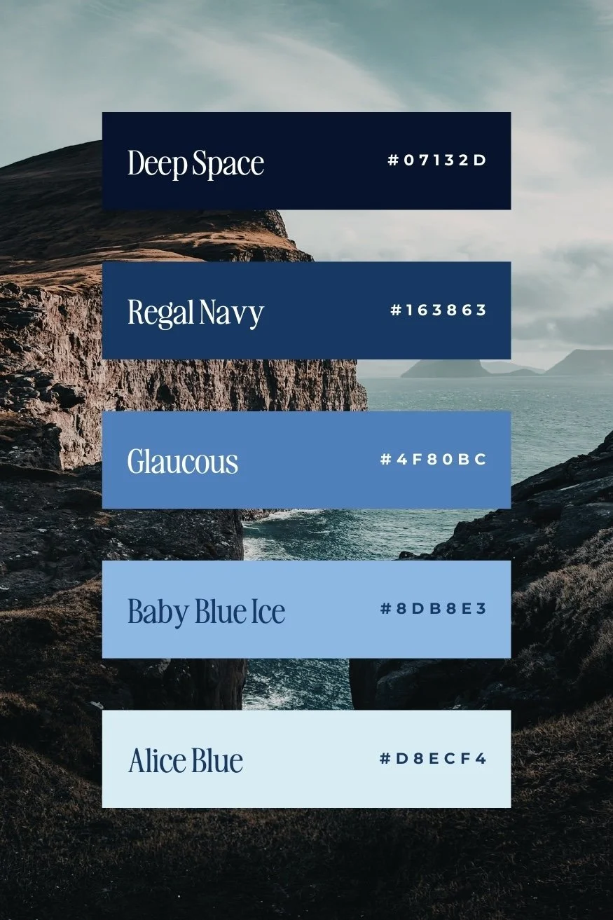
Blue Color Psychology: Trust, Stability, and Professionalism
Blue is one of the most universally trusted colors in branding.
It communicates:
Reliability
Security
Calm confidence
Professional authority
This is why you’ll see blue heavily used in finance, wellness, consulting, and service-based industries.
Best for: Coaches, consultants, therapists, wellness brands, corporate service providers.
Pro tip: Softer blues feel calming and elevated. Dark navy feels authoritative and premium.
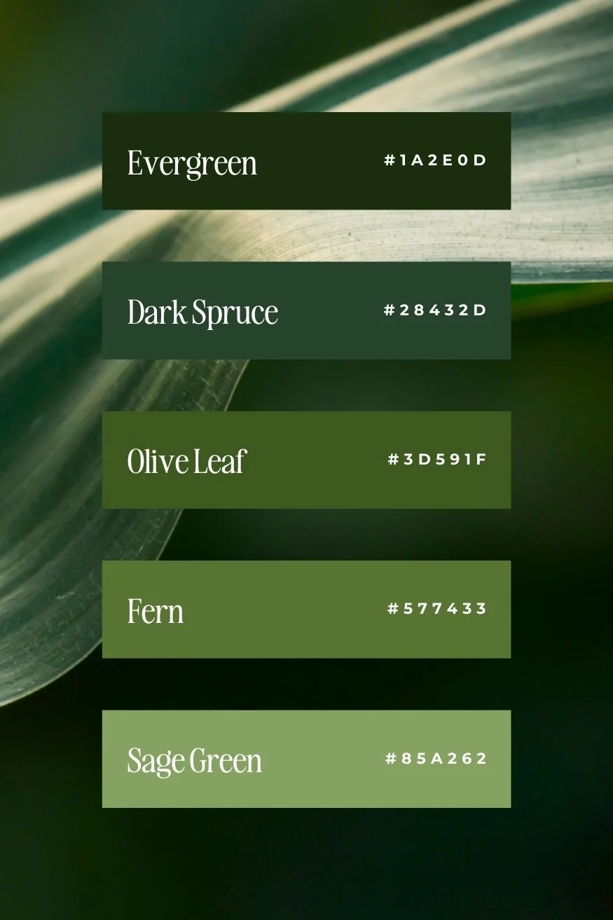
Green Color Psychology: Growth, Healing, and Balance
Green represents:
Growth
Health
Renewal
Sustainability
It’s especially powerful for wellness brands, eco-conscious businesses, and brands that want to communicate grounded energy.
Best for: Holistic brands, sustainable businesses, health-focused services.
Pro tip: Deep forest greens feel luxurious. Sage tones feel modern and calming.
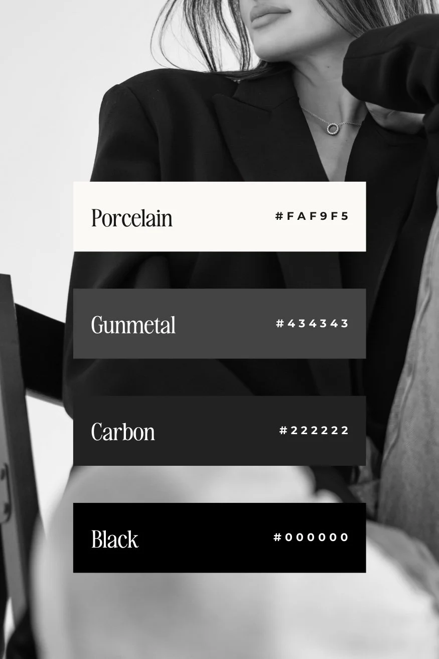
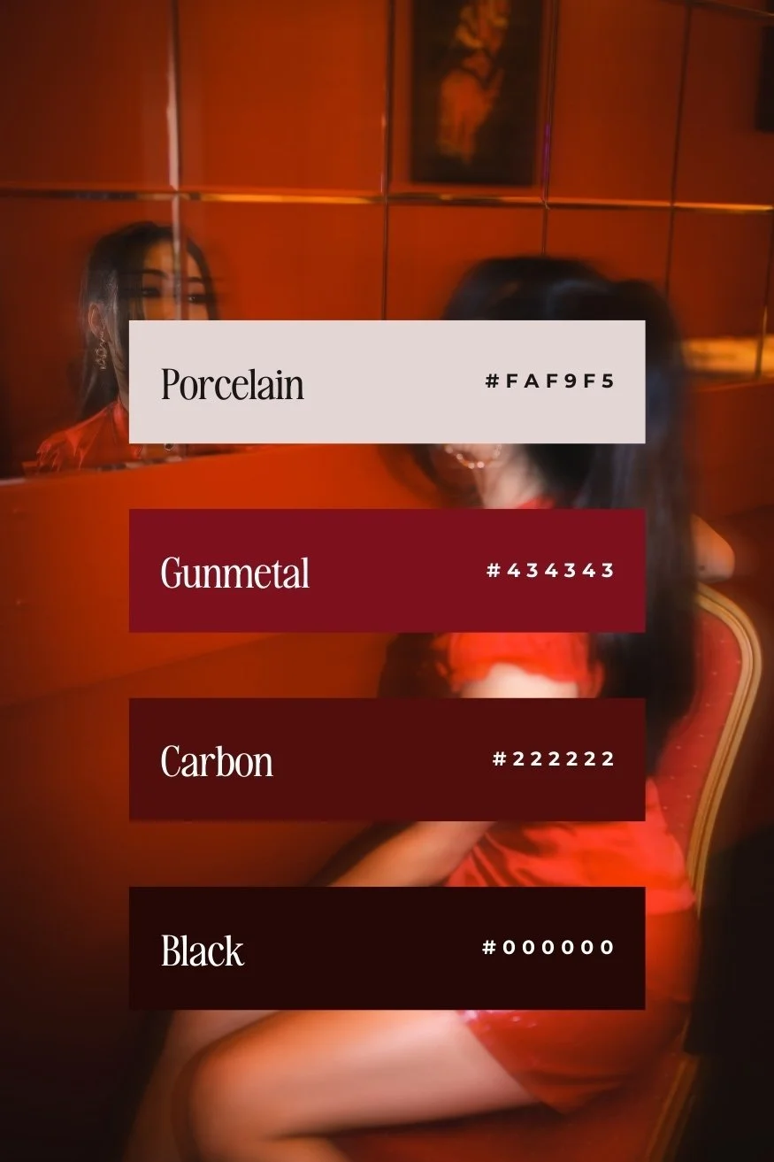
Black Color Psychology: Authority, Luxury, and Sophistication
Black is bold. It signals power.
It communicates:
Authority
Exclusivity
High-end positioning
Confidence
Black is often misunderstood, when paired correctly with neutrals or metallics, it elevates your brand instantly.
Best for: Wedding professionals, photographers, luxury service providers, high-ticket brands.
Pro tip: Balance black with warmth so your brand doesn’t feel harsh or unapproachable.
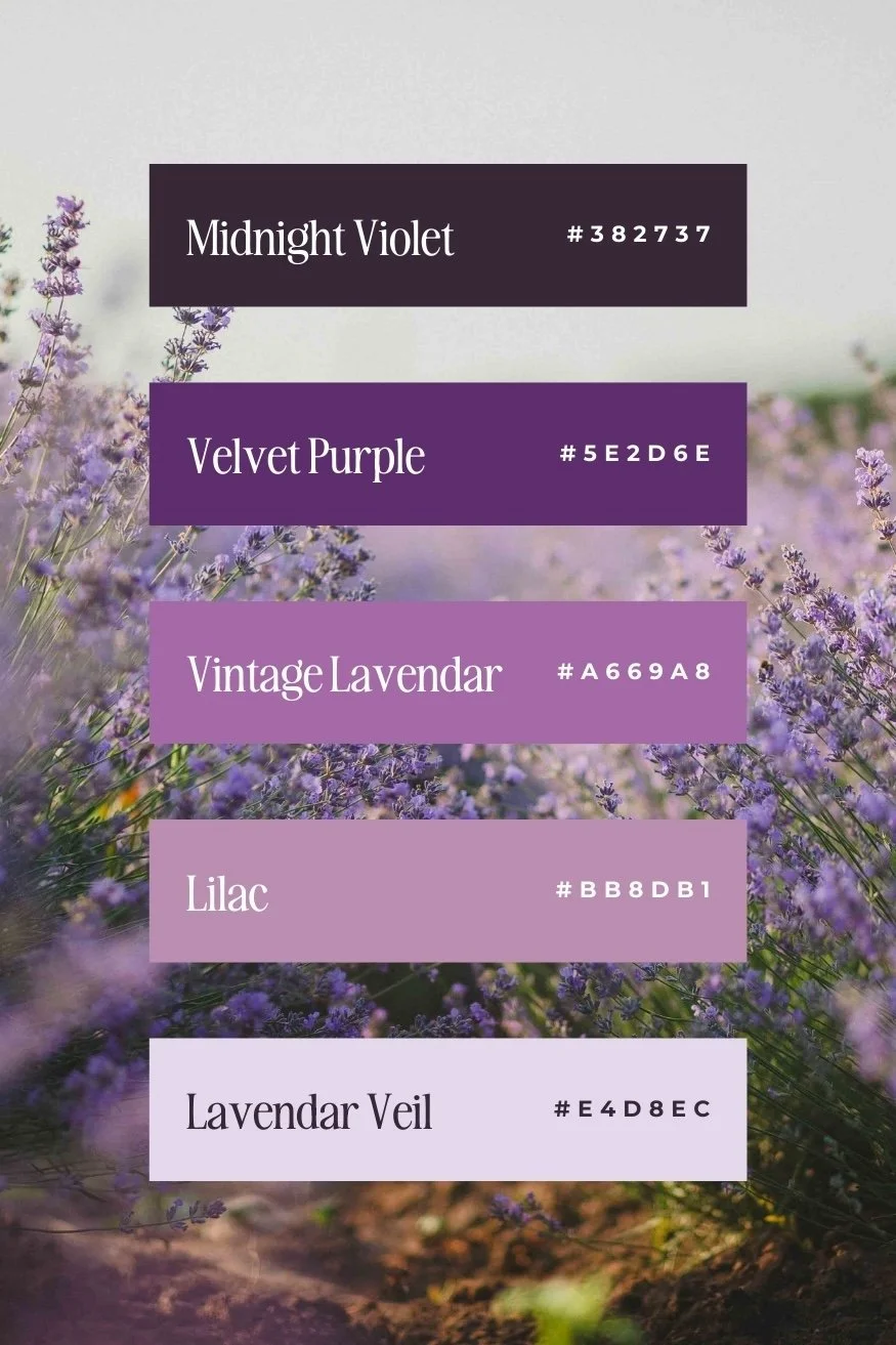
Purple Color Psychology: Creativity and Premium Energy
Purple is typically associated with royalty and creativity.
It communicates:
Imagination
Innovation
Elevated thinking
Premium quality
Lighter lavenders feel soft and feminine. Deep plum tones feel rich and dramatic.
Best for: Creative entrepreneurs, personal brands, visionary founders.
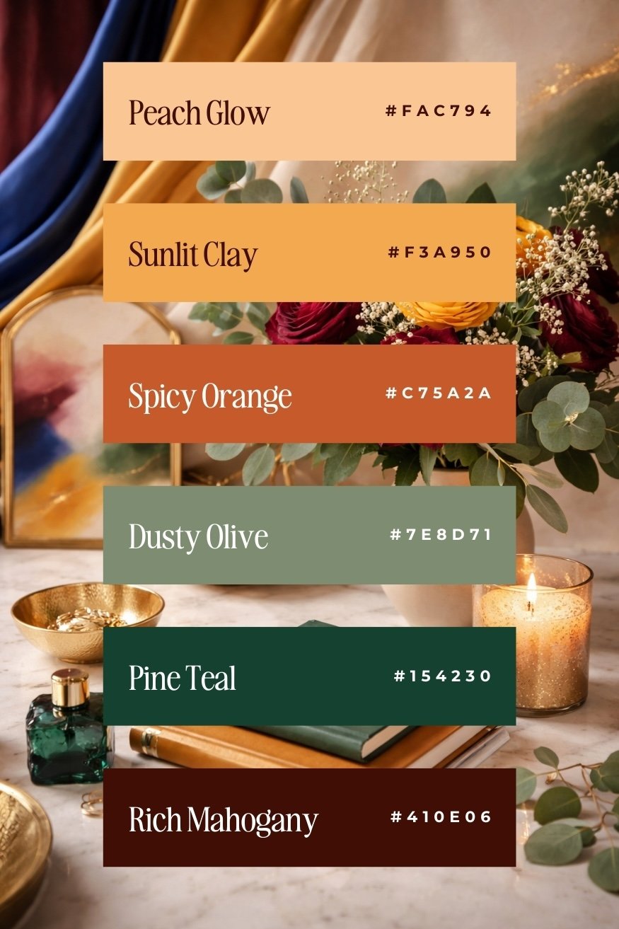
Red Color Psychology: Confidence and Urgency
Red is attention-grabbing. It communicates:
Passion
Boldness
Strength
Action
Used strategically, red can drive urgency and confidence. Overused, it can feel aggressive.
Best for: Fitness brands, bold coaches, high-energy service providers.
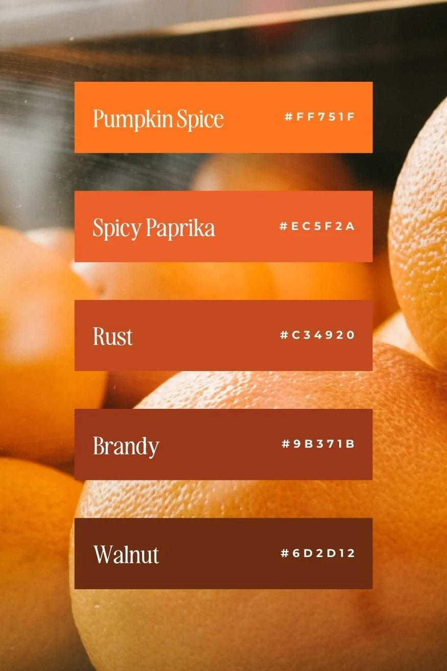
Orange Psychology: Energy and Approachability
Orange blends the power of red with the warmth of yellow. It communicates:
Enthusiasm
Approachability
Creativity
Community
It’s a great choice if you want to feel inviting without losing personality.
Best for: Community-based brands, nutrition brands, creative businesses, lifestyle services
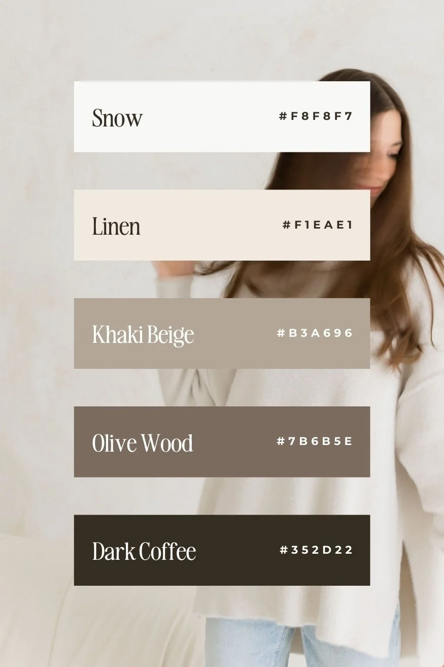
Neutrals Color Psychology: Sophistication and Balance
Neutrals are the backbone of a strong brand kit. They communicate:
Elegance
Timelessness
Calm
Refinement
Neutrals create breathing room and allow your typography, imagery, and messaging to shine.
Best for: Wedding professionals, interior designers, editorial brands, wellness services.
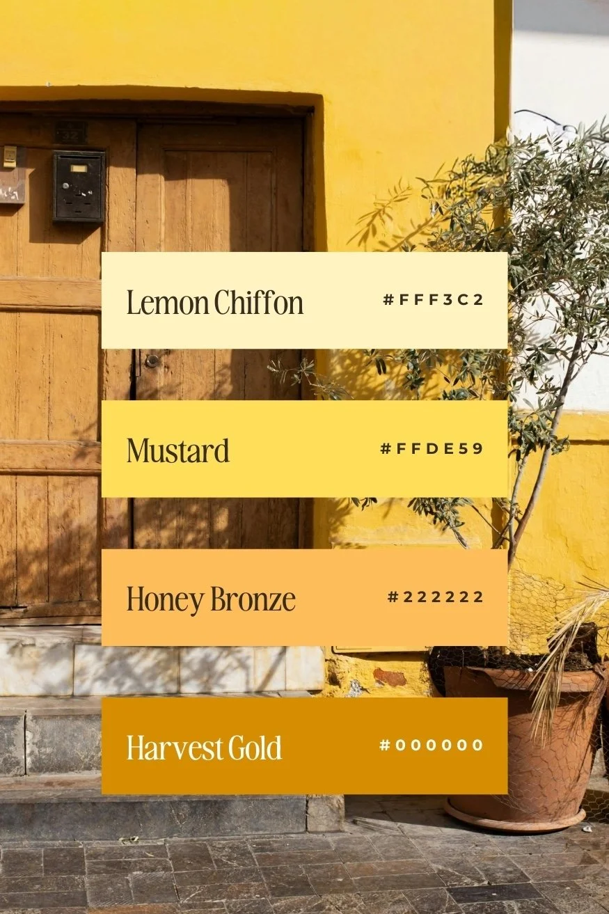
Yellow Color Psychology: Optimism and Visibility
Yellow grabs attention in a lighter, more joyful way than red. It communicates:
Optimism
Creativity
Youthfulness
Warmth
Used sparingly, yellow makes beautiful accent colors and call-to-action highlights.
Best for: Creative service brands, uplifting personal brands, playful businesses.
Choosing Powerful Colors Is Only Step One
Here’s the truth:
Picking a powerful color doesn’t automatically make your brand powerful.
What actually creates impact is:
How colors work together
How they contrast for readability (a must for accessibility!)
How they support your messaging
How they reflect your pricing and positioning
How consistently they’re applied across your website, social, and other brand touch points
A brand kit is not just about “what looks good.”
It’s about building a cohesive color system that supports trust, clarity, and conversion.
How to Choose the Right Brand Colors for Your Business
If you’re second-guessing your current palette, it’s usually not because you “picked the wrong color.”
It’s because your brand has evolved, and your visuals haven’t caught up.
Choosing the right brand colors isn’t about trends. It’s about alignment.
When color psychology, positioning, and strategy align, your brand feels:
Clear
Confident
Elevated
Memorable
And that’s when your website starts working for you.
Because powerful colors don’t just look good, they communicate value before you ever say a word.
Color Generator to Refine Your Palette
If you’re still experimenting with your brand colors, a great tool I highly recommend and use myself is Coolors, a color palette generator that helps you quickly create cohesive color combinations.
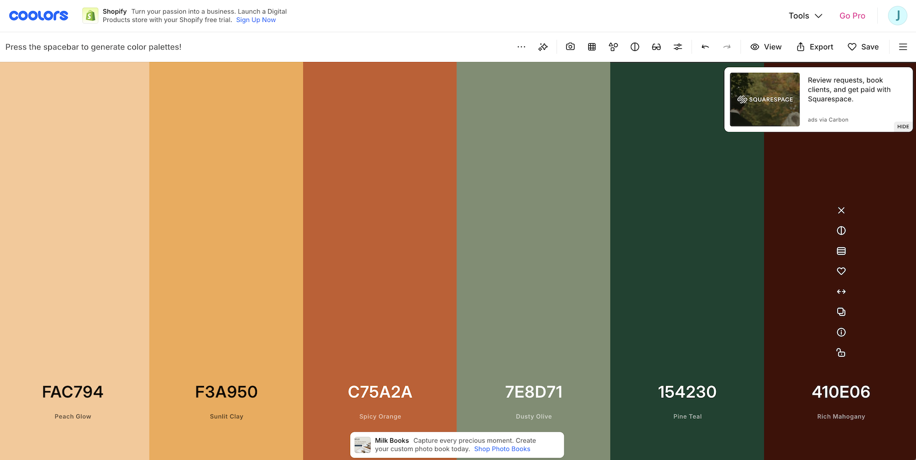
Coolors allows you to:
Generate unlimited color palettes
Adjust shades and tones instantly
Lock in colors you love and build around them
Export hex codes for your brand kit
It’s a great starting point if you’re brainstorming ideas before committing to a full brand strategy.
That said, tools generate combinations, but strategy determines whether those colors actually position your brand correctly.
If you want help turning a pretty palette into a conversion-focused brand system, that’s where professional brand design makes all the difference.

Ready to Build a Strategic Brand Kit?
If you’re done guessing and ready to build a brand rooted in psychology and long-term positioning, explore my Brand Suite services or book a clarity call.
Because powerful colors are only powerful when they’re used with intention.
Building a Strong Brand Foundation goes Beyond Just Color
Choosing powerful colors is an important step in building your brand, but it’s only one piece of the puzzle.
A strong brand foundation also includes:
Clear positioning
Audience clarity
Messaging strategy
Visual hierarchy
Typography systems
Brand voice consistency
Website alignment
If your color palette feels off, it’s usually not just a color issue.
It’s a strategy issue. That’s why I created a free resource to help you evaluate your brand as a whole.
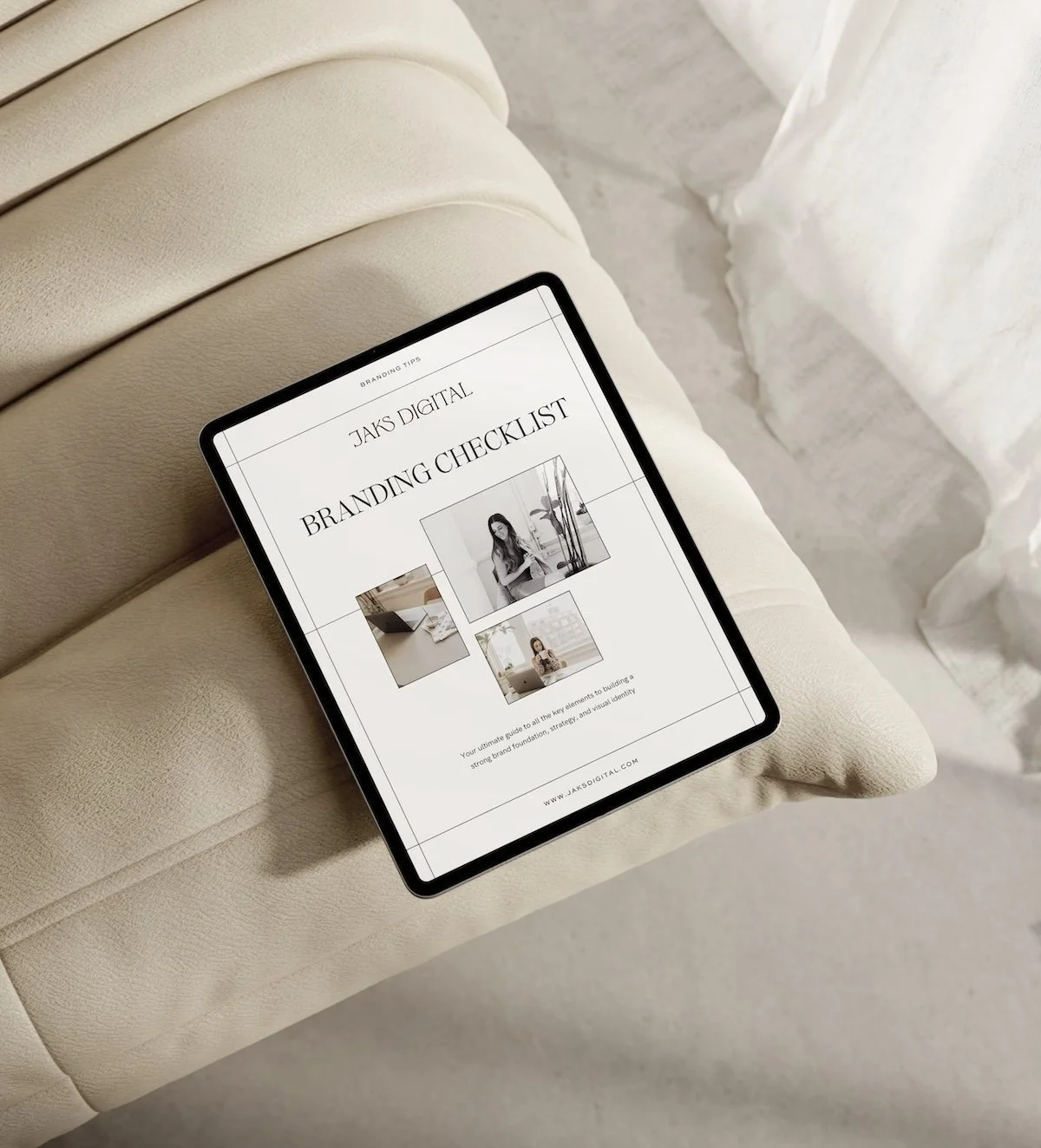
Download the free Brand Building Checklist
Inside, you’ll walk through:
Brand clarity questions
Visual identity checkpoints
Messaging alignment prompts
Website consistency review
Strategy gaps most business owners miss
It’s designed to help you move from “I think this works” to “I know this is aligned.”
Because powerful colors matter, but powerful brands are built on clarity.