
Website Design for Therapists: How to Build Trust Before the First Session
Someone searching for a therapist is doing something hard. They've acknowledged they need support, they've decided to look for help, and now they're sitting in front of a list of strangers trying to figure out who they can trust with the most private parts of their life.
Your website is the first answer to that question.
Before they call, before they email, before they book a consultation, they're on your website deciding whether you're safe. Whether you get it. Whether working with you might actually help.
Most therapy websites fail this moment. Not because the therapist isn't good at their work, but because the website was built around credentials and logistics instead of around the person who's trying to decide whether to reach out.
Here's what a therapy website actually needs to do its job.
Why Therapist Website Design Is Different
A med spa client wants to feel like they're in good hands. A lawyer client wants to feel like you can win. A therapist client wants to feel like you understand them, before they've told you anything.
That's a fundamentally different trust-building challenge, and it requires a completely different approach to design and copy.
The person landing on your website is often anxious, overwhelmed, or uncertain.
They may have tried therapy before and had a bad experience.
They may be reaching out for the first time and terrified of what that means.
They are not in research mode the way someone shopping for a product is.
They're in a vulnerable state, looking for safety signals.
Everything on your website, the colors, the typography, the photos, the copy, the pace of information, should be creating that sense of safety. Warmth before credentials. Understanding before expertise. Human before professional.
What a High-Converting Therapy Website Actually Needs
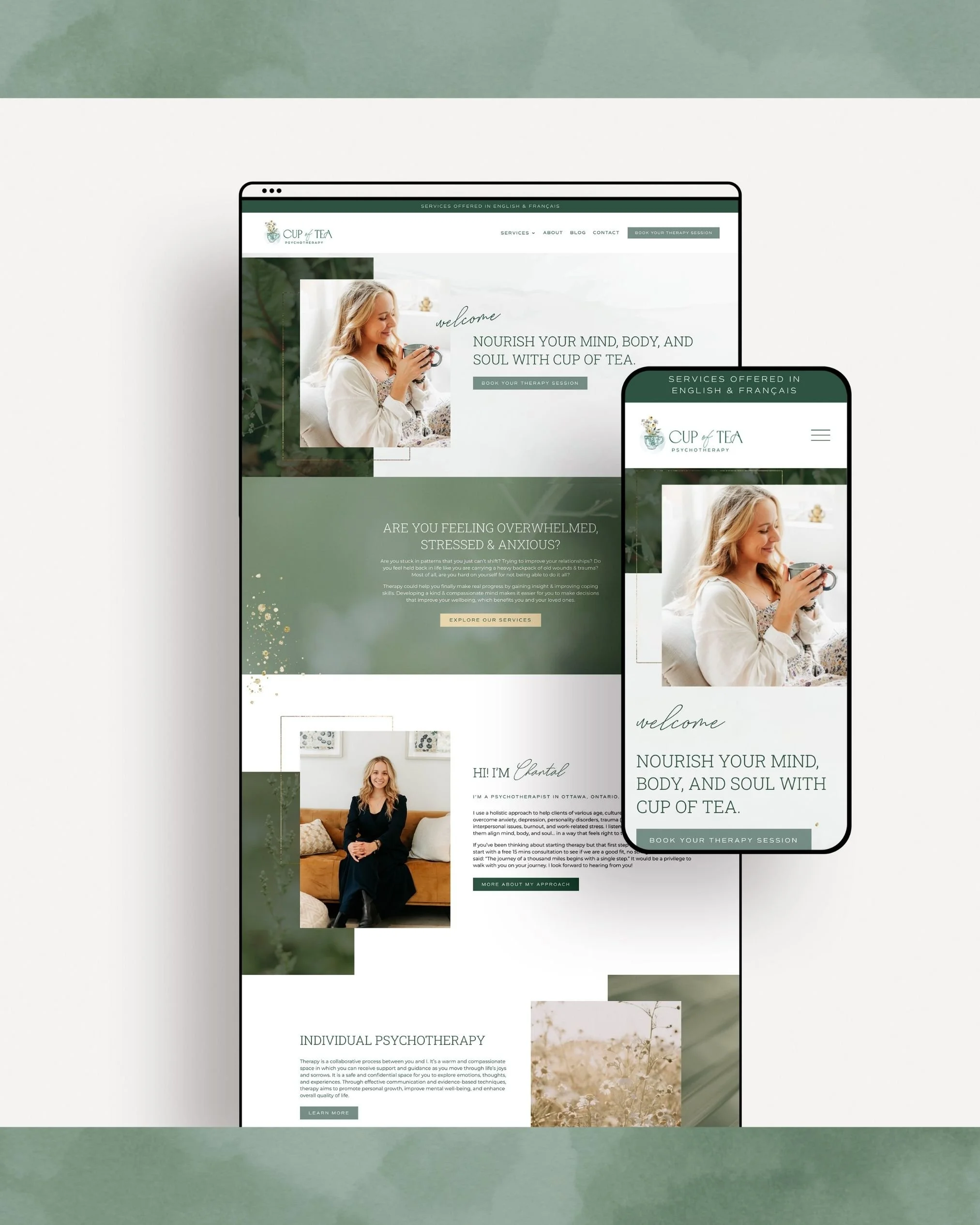
1. A Homepage That Speaks to the Client First
The most common mistake on therapy homepages: leading with your name, your title, and your modalities. LCSW, EMDR, CBT, DBT. Letters and acronyms that mean a great deal to you and very little to someone who is searching for help at 11pm.
Your homepage hero, the first thing someone sees before they scroll, needs to speak to them, not at them. Not 'Dr. [Name], Licensed Psychotherapist Serving [City].' Instead: something that tells them you understand where they are and what they're looking for.
Think about what your ideal client is actually feeling when they land on your site. Name that. Acknowledge it. Then bridge to how working with you is different from where they are now.
Credentials and specialties matter, but they belong further down the page, or on your About Page after you've established that you get it.
2. Warm, Human Photography

Professional headshots on a white backdrop are not enough for a therapy website. Your photos need to make someone feel like they're meeting you, not interviewing you.
The best therapy website photography shows you in your actual office or a warm, comfortable environment. It shows your face clearly, with genuine warmth, not a stiff professional smile. It makes the person looking at it feel like they could sit across from you and feel okay.
If you don't have professional photos yet, this is the highest-impact investment you can make in your website before anything else. Therapy is one of the few professions where who you are personally is part of the service. The photos have to show that.
A few extras that work well on therapy sites: a photo of your actual office space, details that convey calm (a plant, soft light, a cozy chair), and candid or lifestyle shots that show your personality outside of the clinical context.
3. Copy That Meets People Where They Are
Therapy website copy needs to do something unusual: it needs to make the reader feel seen before they've said a word.
This means writing about the experience your clients have before they come to you, the specific thoughts, the feelings, the patterns, in language that makes them think 'yes, that's exactly it.' Not clinical descriptions of presenting issues. Not a list of what you treat. The lived experience of what it feels like to be them right now.
Then bridge to what working with you looks like. What shifts. What becomes possible. What they might feel after a few months of working together.
The before and after isn't about symptoms and diagnosis, it's about quality of life and how they move through the world.
4. A Specialties Page That Explains, Not Just Lists
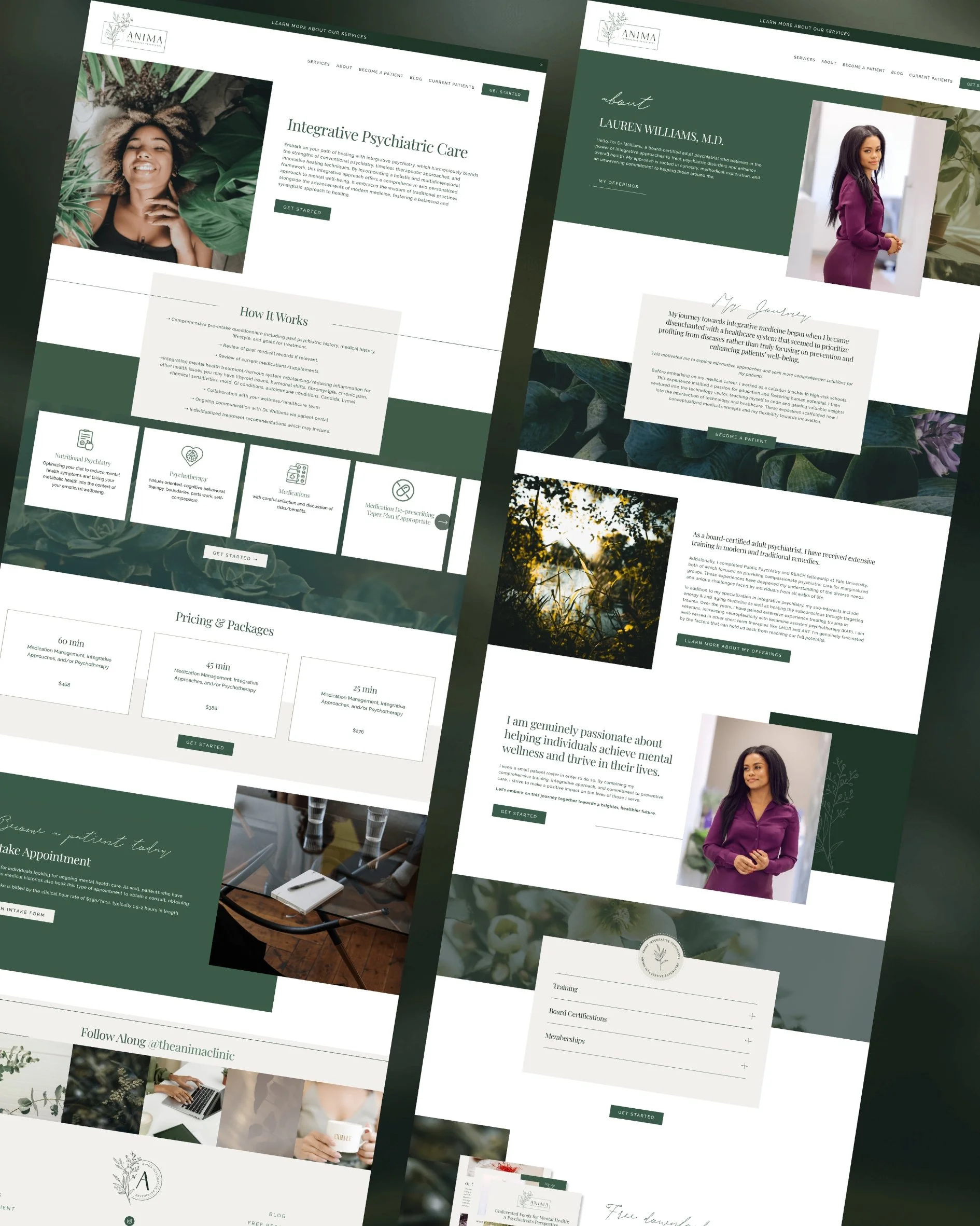
Most therapists have a specialties or 'issues I work with' page that reads like a diagnostic checklist. Anxiety. Depression. Trauma. Relationship issues. These lists are necessary but they're not doing any trust-building work.
Consider writing a brief, human description for each specialty, what this experience feels like, who comes to you with it, and what the work together looks like. Even a few sentences per specialty does more work than a bullet point.
If you have deep expertise in a specific area — trauma, perinatal mental health, eating disorders, LGBTQ+ affirming care — give that specialty its own page or a dedicated section. Specificity builds trust faster than generalism. The person who knows you specialize in exactly what they're dealing with is much more likely to reach out than someone who sees a long list that includes their issue somewhere in the middle.
5. A Clear, Low-Friction Path to Contact
The final step, getting someone to actually reach out, is where a lot of therapy websites fumble. The contact form is buried. The process for booking a consultation isn't explained. There's no clarity on what happens after they submit the form.
Your contact page needs to:
Open with warmth, not just a form. A brief line that acknowledges this step is hard and that you're glad they're here.
Explain what happens next, I'll respond within 48 hours. We'll schedule a free 15-minute consultation. There's no obligation.
Remove as much uncertainty as possible, questions like 'what if I'm not sure if I'm ready?' should be addressed, not ignored.
Make online booking available if possible, many people searching for a therapist want to schedule without a phone call. If your practice management system allows it, offer it.
The person who got all the way to your contact page has done the hardest part. Your job is to make the next step feel as easy and safe as possible.
6. Practical Information That Reduces Barriers
Logistics matter more on therapy websites than on almost any other service business site. Before someone books, they need to know:
Whether you take insurance (and which ones), or if you're private pay
Your session fees and whether you offer a sliding scale. I strongly believe in price transparency or at least a starting at price or range.
Whether you offer in-person, telehealth, or both
Where you're located if in-person (and whether there's parking)
Your availability,are you taking new clients right now?
Not having this information on your site doesn't make you seem more exclusive, it creates friction. People who can't afford your rate or aren't covered by your insurance will reach out, realize it's not a fit, and leave frustrated. People who would be a perfect fit may think the worst and not reach out at all. Transparency is a kindness here.
Want to see exactly what belongs on every page of your service website, including what makes a contact page actually convert?
The free Service-Business Website Blueprint covers it all.
What Doesn't Work on Therapy Websites
Clinical Language as the Primary Voice
Your potential client doesn't speak that language. Write for them first, use clinical language sparingly and only where it adds credibility rather than confusion.
A Generic Template That Looks Like Every Other Therapist Website
The therapy website space has a look. Soft blue or sage green. A lotus flower or meditation hands stock photo. An abstract watercolor background. None of it is wrong exactly it’s about how you use it. But, when every therapist in your area has the same template and vibe, nothing distinguishes you.
Your website should feel like you. Your specific warmth, your specific approach, your specific personality. That distinctiveness is what makes someone choose you over the other therapist who showed up in the same search.
No Photo of You, Or a Bad One :)
Some therapists prefer not to have photos for privacy reasons, which is entirely valid. But if that's not a concern for you, not having a photo is a missed opportunity. And a small, low-resolution, or stiff photo is almost worse than none. People need to see you. It's part of the decision.
The Difference Between a Therapy Website That Gets Found and One That Converts
Getting found on Google requires SEO, the right keywords, structured content, a technically clean site. Getting someone to actually reach out requires trust, the right copy, the right images, the right design that creates safety and warmth.
Most therapy websites are weak on both. The ones that work are built with both in mind from the start.
If you're interested in what SEO looks like for a service business specifically, this post covers the website strategy that drives organic traffic for businesses like yours.
Ready to Build a Therapy Website That gets found and Actually Converts?

If your current website isn't reflecting the quality of care you provide, or if you're starting fresh and want to do it right, this is the work I do.
I build custom Squarespace websites for service businesses including therapists, counselors, and mental health professionals. Every project starts with strategy: who you're trying to reach, what they need to feel to reach out, and how to build a site that bridges that gap.
Start with the free Service-Business Website Blueprint, the page-by-page guide to what every service website needs. Then, when you're ready to talk, book a free discovery call.