
Choosing a therapist is one of the most vulnerable decisions a person makes. Before someone ever books a consultation, they're quietly asking a lot of questions:
Will this person understand me?
Will I feel safe here? Is this the right fit?
For most potential clients, your website is where those questions get answered first.
That's why the best therapist websites don't just look calm and pretty. They make someone feel understood before they've said a single word, and they make reaching out feel easy instead of intimidating.
Below are four therapist website examples from practices I've worked with, each with a very different personality, along with what makes each one work and what you can take from them for your own practice.

What the Best Therapist Websites Have in Common
Every practice is different, but the strongest therapy websites tend to share a few qualities.
They speak directly to how the client is feeling right now, not just what the therapist is trained in.
They explain services in plain, human language.
They make the next step obvious and low-pressure, whether that's a free consultation or a simple inquiry form.
And they carry a brand that feels consistent and trustworthy from the homepage all the way to the contact page.
If you want the full breakdown of how to plan and build a site like this, our guide to website design for therapists walks through it step by step. For now, let's look at what those principles look like in the real world.
Example 1: NOURISH
NOURISH is a holistic psychotherapy practice in Bozeman, Montana, rooted in nature, movement, and honest connection. Sessions happen in person, outdoors on Montana's trails, and virtually, so the website needed to communicate something most therapy sites never attempt: that the landscape itself is part of the healing.2. Warm, Human Photography
What Makes It Work
The services are what set this site apart. Instead of listing clinical modalities, the offerings are organized around four simple words: Talk, Walk, Flow, and Grow. Each one has its own page and its own clear description, from slow, 90-minute in-person sessions to walk-and-talk therapy outdoors and longer EMDR intensives. A potential client can understand the options at a glance and choose what feels right, which mirrors the practice's philosophy that clients always decide what they need.
The copy does a lot of the heavy lifting, too. It speaks to the person who has "read the books and done the work" and still feels stuck, so the right client recognizes themselves within the first few lines. Behind the scenes, the site was also built with local search in mind, with Bozeman and holistic psychotherapy woven naturally into the homepage so nearby clients can actually find it.
Example 2: Cup of Tea Psychotherapy
Cup of Tea Psychotherapy is an Ottawa practice offering in-person and virtual psychotherapy. The goal for this brand was clear from the start: help people feel understood, cared for, and at ease while they search for support, with an identity that's warm, compassionate, calming, and approachable. The name itself does a lot of that work, since few things feel more comforting than sitting down with a cup of tea.
What Makes It Work
The site leads with the feeling of being supported. "We walk alongside your healing journey" sets the tone right away, telling visitors this is a partnership, not a clinical transaction.
The structure is just as thoughtful. Specialty pages, like the practice's neurodiversity-affirming ADHD therapy page, speak directly to specific clients in their own language, describing days that feel "like your mind has too many tabs open." Pages like these help the right people feel seen, and they give the site more ways to show up in search for what clients are actually looking for. A simple inquiry form makes it easy to reach out for a free consultation without overthinking the first step.
The best therapist websites don't start with credentials.
They start with how the client feels, then make it easy to take the next step.
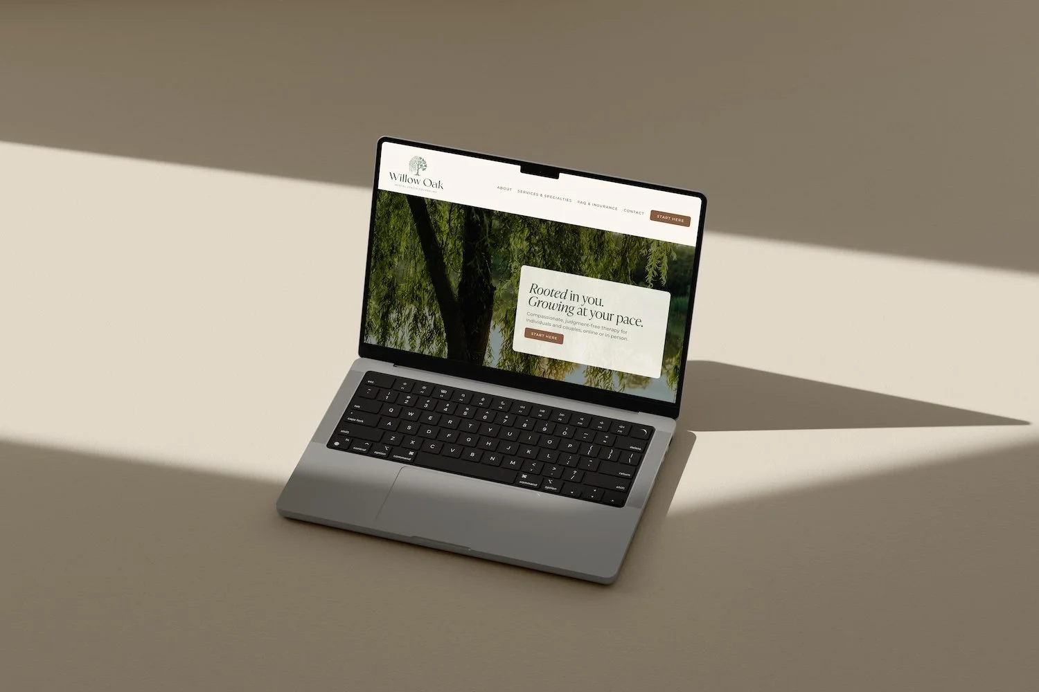
Example 3: Willow Oak Mental Health Counseling
Willow Oak Mental Health Counseling needed a brand that reflected the balance at the heart of the practice's work: softness and strength, flexibility and stability. That idea became the foundation for the entire visual identity.
What Makes It Work
The primary logo features a hand-illustrated, woodcut-style tree that merges a weeping willow and an oak into a single form. The willow's flowing branches represent flexibility and emotional release, while the oak's sturdy trunk and roots represent strength and growth, reflecting the balance clients work toward in counseling. It's a logo with real meaning behind it, which makes the brand feel personal rather than generic.
The color palette carries that grounded feeling throughout, with earthy tones like oak brown, pine, olive, and soft teal balanced by warm neutrals like bone and parchment. Paired with an elegant serif and a clean, widely spaced sans-serif, the brand feels calm and sophisticated without ever feeling cold. A full system of alternate logos and submarks keeps it consistent everywhere it appears, which is exactly why we recommend having multiple versions of your logo.
This website design is in progress and is coming soon!
Example 4: Anima Integrative Psychiatry
Psychiatry websites face a challenge most therapy sites don't: they need to feel clinically credible and deeply human at the same time. Anima Integrative Psychiatry wanted a site that felt professional, intuitive, and approachable, one that would help people feel empowered to take control of their mental health journey rather than intimidated by it.

What Makes It Work
The brand was built around four words: intuitive, approachable, competent, and empowering. A clean wordmark logo and a refined, minimal palette give the practice an air of quiet expertise without the cold, clinical feel many medical websites fall into.
The messaging does the rest. Instead of leading with diagnoses or prescriptions, the site centers on the practice's solution-oriented, personalized approach, focused on long-term well-being rather than quick fixes. Practical details matter here too. Clear legal pages, including a HIPAA privacy notice, are built right into the site, which quietly reinforces trust for anyone weighing whether to reach out.
What You Can Take From These Therapy Website Examples
You don't need a mountain backdrop or a cozy brand name to build a website that works. What these four practices share is a clear sense of who they serve and a site that speaks to that person directly.
Start with your client's experience, not your resume. Credentials matter but after someone already feels understood. Name your services in a way a non-therapist can understand, and give your specialties their own pages so the right people (and google) can find them. Choose colors and imagery that match how you want clients to feel in your office, and our guide to powerful brand colors is a helpful place to start. Finally, make reaching out feel easy, with one clear next step on every page.
If you already have a site and you're not sure how it measures up, a website audit gives you a clear list of what's working and what to fix first. And if your brand needs more than a few website tweaks, our post on how much branding costs can help you plan for it.
Frequently Asked Questions
-
At minimum, a homepage that speaks to your ideal client, an about page that builds trust, clear service or specialty pages, information on fees and insurance if relevant, and an easy way to book a consultation or reach out.
-
A template can work when you're just starting out, but a custom design helps your practice stand out and reflect your specific approach, which matters in a field where clients are choosing based on how safe and understood they feel.
-
Yes. Squarespace is easy to update on your own, looks polished on mobile, and works well with booking tools, inquiry forms, and email marketing, which makes it a great fit for most private practices.
-
It depends on the number of pages, whether branding is included, and how much copy and SEO support you need. Our breakdown of the average cost of a 10-page website is a good starting point.
Ready for a Website That Feels Like Your Practice?

Your website is often the first conversation a potential client has with you. If yours doesn't yet reflect the care you bring to your sessions, let's change that. We design brands and Squarespace websites for therapists and wellness practitioners that help the right clients feel safe reaching out.
